tirsdag 19. desember 2017

No, GW didnt start 400 years ago


Nå går "spagetti"-grafen til IPPC rundt i amatør-fornekter-ekkokammer bloggene. Startet global oppvarming for 400 år siden?


The IPPC "spaghetti-graph is being recycled in the amateur denier echo chamber bloggs these days. Did GW start 400 years ago?


Edward John Healey sitt bilde.


For everyone who needs the graph explained AND to end all these silly misinterpretations of the graph:

Here is what the IPPC report says about the graph (fig 5.7)

"The median of the NH temperature reconstructions (Figure 5.7) indicates mostly warm conditions from about 950 to about 1250 and colder conditions from about 1450 to about 1850; these time intervals are chosen here to represent the MCA and the LIA, respectively."

THERE IS NO DOUBT, THE WARMING CAUSED BY HUMANS STARTED CA 1850:

The Medieval Warm Period and The Little Ice age was also NOT global, like todays warming is (and which also includes the oceans).

https://www.ipcc.ch/pdf/assessment-report/ar5/wg1/WG1AR5_Chapter05_FINAL.pdf

NOAA:
The similarity of characteristics among the different paleoclimate reconstructions of the last 2,000 years provides confidence in the following important conclusions, as reported in the Intergovernmental Panel on Climate Change Fifth Assessment Report:
Dramatic warming has occurred since the 19th century.

For average annual Northern Hemisphere temperatures, the period 1983–2012 was very likely the warmest 30-year period of the last 800 years and likely the warmest 30-year period of the last 1,400 years.

Warmer than average temperatures are more widespread over the Northern Hemisphere since the mid 20th century than in any previous time.

https://www.ncdc.noaa.gov/global-warming/last-2000-years

https://en.wikipedia.org/wiki/Little_Ice_Age

5 centimeters above the picture of the graph, IPPC clearly says there was "colder conditions from 1450 to about 1850":

Roger Fjellstad Olsen sitt bilde.

fredag 15. desember 2017

Old newspaper stories, vineyards and ships trapped in ice


Når amatør-fornekterne tror at gamle avisartikler og historier om forskningsskip som "sitter fast i isen" "motbeviser" Global Oppvarming eller prøver å fortelle oss at dagens oppvarming ikke er noe spesiell.


Denne teksten har gått sin runddans i kokohhøyre propagandablogger og i klimafornekterkretser i åresvis. Den er basert på en artikkel som er ekte nok,  men senere versjoner har lagt til den falske setningen 

"Within a few years it is predicted that due to the ice melt the sea will rise and make most coast cities uninhabitable".


Her er de enkle forklaringene.


"This implies that this article – when seen in context – is actually strongly confirming of a considerable decline in Arctic sea ice over the last 90 years. Not that CFACT is going to tweet that."


"The warming phenomena observed in 1922 proved to be indicative only of a local event in Spitzbergen, not a trend applicable to the Arctic as a whole.

Those who seek to deny global warming constantly use transparently obvious tricks, selecting data from a single time, a single place, or both, to deny the larger long-term global patterns. This is easily done as climate is constantly fluctuating, so picking out the mean patterns and trends requires that one integrates the data over the largest time and space scales possible. So if one dishonestly wants to misrepresent the larger patterns, one can always find a particular place at a particular time that does not agree with the all the rest averaged together. This is sometimes referred to as the “It’s a cold day in Wagga Wagga” approach, and is repeatedly used by the climate change deniers to fool people who haven’t looked at the data themselves. The changes in Arctic Ice are no exception! [...]

Note that there are year to year fluctuations of about 1 million square kilometers, due to annual weather variations. These spatial variations have been used by deniers who simply look at changes since 2007, an exceptionally warm year in the Arctic, to suggest that the Arctic is cooling down! In other words they are simply picking ONE point that falls a bit off the trend of ALL the data to deny the long-term trend.

This set of observations from a limited area (Spitzbergen) in one year has been used by deniers to suggest that there are huge natural fluctuations, and to imply that there is no global warming. Now since the satellite data only goes back to 1979, it is perfectly legitimate to suggest that the trends since 1979 may not match the trends when looked at over a longer time period. One has to look at long-term data from ice extent measured in the sea and from shore, and air and water temperature data, over the longest time periods available. So let’s look at what this data actually shows!

Here are the measured long-term Arctic (red) and Antarctic (green) temperatures trends: 


Artic warming trend from NOAA:

Highlights

  • The average annual surface air temperature anomaly over land north of 60° N for October 2015-September 2016 (+2.0° C, relative to a 1981-2010 baseline) was by far highest in the observational record beginning in 1900; this represents a 3.5° C increase since the beginning of the 20th Century.
  • Arctic temperatures continue to increase at double the rate of the global temperature increase.
  • Extreme Arctic-wide air warm temperatures in winter 2016 (Jan-Mar) greatly exceeding the previous record; several locations showed January anomalies exceeding +8° C. These conditions were primarily due to southerly winds moving warm air into the Arctic from mid-latitudes and the presences of sea ice free areas to the northeast of Novaya Zemlya.
  • Neutral to cold temperature anomalies occurred across the central Arctic Ocean in summer 2016; a condition which did not support rapid summer sea ice loss.

Arctic (land stations north of 60° N) and global mean annual land surface air temperature (SAT) anomalies (in °C) for the period 1900-2016 relative to the 1981-2010 mean value:


Fig. 1.1. Arctic (land stations north of 60° N) and global mean annual land surface air temperature (SAT) anomalies (in °C) for the period 1900-2016 relative to the 1981-2010 mean value. Note that there were few stations in the Arctic, particularly in northern Canada, before 1940. The data are from the CRUTEM4 dataset, which is available at www.cru.uea.ac.uk/cru/data/temperature/.

http://www.arctic.noaa.gov/Report-Card/Report-Card-2016/ArtMID/5022/ArticleID/271/Surface-Air-Temperature


Abstract
From the 1920s to the 1940s, the Artic experienced significant warming that is comparable to the recent 30-year warming. The former warming was concentrated mostly in high latitudes, in contrast to the recent 30-year warming, which has occurred in all latitudes. Several explanations have been proposed; however, one of these proposed explanations, single external forcing, which could once explain the global average, failed to explain the early 20th century scenario. A second possible explanation was internal atmospheric variability with low frequency. Another candidate for the explanation was still forcing by black carbon deposited on snow and ice surfaces. The answer is most likely to be a combination of intrinsic internal natural climate variability and positive feedbacks that amplified the radiative and atmospheric forcing. We must continue our study by discovering historical data, analyzing ice cores, reanalyzing the Arctic system together with long-term reanalysis dating back to the 1880s, and also determine the contributions of each factor.
https://www.sciencedirect.com/science/article/pii/S1873965211000053


There is no large-scale warmth during 1922 visible.

Next let’s look at the long term measured sea surface temperature anomaly (the difference with the long term average) of Arctic temperature.


It is clear that what happened in Spitzbergen in 1922 does NOT represent the Arctic as a whole!

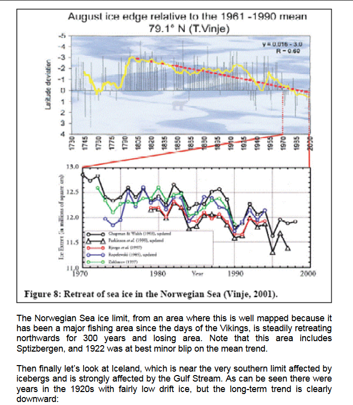
Finally, let’s look at the measured ice extent in the places where there is good long-term data, in Iceland, the Nordic Sea, and the Norwegian Sea (in other words in the region of the Arctic most affected by fluctuations in the Gulf Stream) and including Sptizbergen where the 1922 observation came from. First let’s look at the Nordic Sea, where the ice is retreating in both east and west, and 1922 is not a blip:


Then finally let’s look at Iceland, which is near the very southern limit affected by icebergs and is strongly affected by the Gulf Stream. As can be seen there were years in the 1920s with fairly low drift ice, but the long-term trend is clearly downward:


Den globale gjennomsnittlige overflatetemperaturen er kanskje det mest representative målet på en planetens klima, da den reflekterer hvor mye varme det er på overflaten. Lokale temperaturendringer kan variere markant fra det globale gjennomsnittet. En årsak til dette er at varmen beveger seg rundt med vind og havstrømmer, den varmer opp en region mens den kjøler en annen, men disse regionale effektene kan ikke forårsake en signifikant endring i den globale gjennomsnittstemperaturen. En annen grunn er at lokal albedo, for eksempel endringer i snø eller vegetasjon, som påvirker hvordan en region reflekterer eller absorberer sollys, kan forårsake store lokale temperaturendringer som ikke speiles i det globale gjennomsnittet. Vi kan derfor ikke stole på ett spesifikt sted til å være representativ for global temperaturendring.

Global average surface temperature is perhaps the single most representative measure of a planet’s climate since it reflects how much heat is at the planet’s surface. Local temperature changes can differ markedly from the global average. One reason for this is that heat moves around with the winds and ocean currents, warming one region while cooling another, but these regional effects might not cause a significant change in the global average temperature. A second reason is that local feedbacks, such as changes in snow or vegetation cover that affect how a region reflects or absorbs sunlight, can cause large local temperature changes that are not mirrored in the global average. We therefore cannot rely on any single location as being representative of global temperature change.


Although most locations on the planet have recorded increased temperatures since 1900, changes in global ocean and atmospheric circulation patterns have created small-scale temperature decreases in a few local regions.

Artic temperatures:


http://sites.uci.edu/zlabe/arctic-temperatures/

To end, let’s point out that the Arctic region will be the site of some of the major global positive climate feedbacks, that is to say those processes that will act strongly to AMPLIFY global warming, and whose effects are only STARTING to be felt and will get much stronger in coming years:

1) Ice albedo feedback. An aerial image of the Arctic Ice cap shows that the ocean looks deep blue, nearly black in comparison with ice. The white ice reflects sunlight back to space, reducing warming, while the dark ocean absorbs the light, increasing warming. As ice is replaced by ocean, global warming will accelerate. 

2) Land albedo feedback. As the land warms up, trees and forests migrate north. White snow that reflects sunlight back to space is covered with dark green leaves or dark brown tree trunks and branches, which absorb sunlight and convert it to heat, with the same effect of amplifying global warming. 

3) Tundra permafrost melting Greenhouse gas release feedback. As the tundra permafrost is steadily melting, vast amounts of methane gas trapped beneath in soils, peat, sediments, and ice-like methane hydrates are bubbling up into the atmosphere. This is a greenhouse gas many times more potent than CO2, and its release is rapidly escalating in Siberia, Canada, Alaska, and the Arctic Ocean.

4) Peat oxidation feedback. As frozen tundra peat melts, the frozen organic matter, the world’s largest store of soil carbon, several times larger than that in the atmosphere, is being broken down by microorganisms and released as CO2 to the atmosphere.


BONUS:

Ice Loss and the Polar Vortex: How a Warming Arctic Fuels Cold Snaps


Forklaringer på noen flere værfenomener:

Frost fairs på Themsen, sunspots and the Little Ice Age

Where spin doctors, politicians and newspaper editors understand well that a name alters how something is perceived, scientists know that a name does not change the reality one iota. By virtue of the name awarded to it, the “Little Ice Age” has been associated with full ice ages. The name Little Ice Age has also become almost synonymous with the Maunder minimum in solar activity in the minds of many people. Hence it has even become possible to build semantic arguments that imply there is some sort of link between solar activity and ice ages – and evidence for major control of climate by solar activity is often offered in the form of the occurrence of frost fairs on the Thames in London. This paper discusses the true relationships, or lack of them, between these different events.

https://www.reading.ac.uk/news-and-events/releases/PR717721.aspx


Bonus:

Regional climate impacts of a possible future grand solar minimum
Any reduction in global mean near-surface temperature due to a future decline in solar activity is likely to be a small fraction of projected anthropogenic warming. However, variability in ultraviolet solar irradiance is linked to modulation of the Arctic and North Atlantic Oscillations, suggesting the potential for larger regional surface climate effects. Here, we explore possible impacts through two experiments designed to bracket uncertainty in ultraviolet irradiance in a scenario in which future solar activity decreases to Maunder Minimum-like conditions by 2050. Both experiments show regional structure in the wintertime response, resembling the North Atlantic Oscillation, with enhanced relative cooling over northern Eurasia and the eastern United States. For a high-end decline in solar ultraviolet irradiance, the impact on winter northern European surface temperatures over the late twenty-first century could be a significant fraction of the difference in climate change between plausible AR5 scenarios of greenhouse gas concentrations.


https://www.nature.com/articles/ncomms8535

Global Signatures and Dynamical Origins of the Little Ice Age and Medieval Climate Anomaly
Abstract
Global temperatures are known to have varied over the past 1500 years, but the spatial patterns have remained poorly defined. We used a global climate proxy network to reconstruct surface temperature patterns over this interval. The Medieval period is found to display warmth that matches or exceeds that of the past decade in some regions, but which falls well below recent levels globally. This period is marked by a tendency for La Niña–like conditions in the tropical Pacific. The coldest temperatures of the Little Ice Age are observed over the interval 1400 to 1700 C.E., with greatest cooling over the extratropical Northern Hemisphere continents. The patterns of temperature change imply dynamical responses of climate to natural radiative forcing changes involving El Niño and the North Atlantic Oscillation–Arctic Oscillation.

While England had 42 vineyards at the time of the Domesday Book, as is well known, there are now over 300 commercial English vineyards today. So the climate today in England is much more conducive to wine-making than during the Roman occupation of England.

www.english-wine.com/vineyards.html

By 1977, there were 124 reasonable-sized vineyards in production – more than at any other time over the previous millennium. The website of the English wine producers suggests that at present extent of vineyards in Britain probably surpasses that of the Medieval Warm Period between circa 900 AD to 1300 AD.

Det er blitt nesten 900 vingårder i England og Wales. Salget gikk opp 69 prosent fra 2019 til 2021.


Sea ice can't be in decline until it has completely disappeared?

You're just like the people saying the coronavirus can't kill Alaskans because it hasn't killed many yet.

Klimafornekterne har produsert hundrevis av artikler om forskningsskip som sitter fast i is og følger opp med å kirsebærplukke bilder fra NASA som viser at isen i arktis har vokst. De har heller ingen problemer med å hente sine klimaløgner selv fra alt-right white supremacy-rasist koko-høyre blogger som breitbart. (Hvorfor går de ikke videre til den NASA-siden som har bevisene for AGW?) 

Mengden sjøis er en nedadgående trend. Den er ikke borte. Dette betyr at den fremdeles er der og kan fange skip. Til den faktisk blir borte. Er det vanskelig å forstå? Har du 20 krabbeteiner i sjøen og reduserer antallet til 10, slutter du ikke å fange krabber. Du fanger bare færre.

INGENTING av dette motbeviser global oppvarming. Det nevnte skipet måtte avbryte på grunn av mye is i bevegelse, et resultat av global oppvarming "Climate-related changes in Arctic sea ice not only reduce its extent and thickness but also increase its mobility meaning that ice conditions are likely to become more variable and severe conditions such as these will occur more often."

Antarctic Ship Rescue: 5 Lessons From the Trapped-Vessel Drama

Kevin Trenberth, senior scientist at the National Center for Atmospheric Research, added by email that "any comments about overall ice shrinking or increasing are absurd in this situation.

"In the Antarctic, the ice is not limited by land and it is well established that winds blow the ice around. Winds from the south, especially off the continent, carry ice away from the continent and create more ice behind, filling in any gaps."

As Arctic sea ice breaks up, it’s starting to move southward faster, creating new and unexpected hazards. More icebergs calving off Greenland add to the threat.


First ship crosses Arctic in winter without an icebreaker as global warming causes ice sheets to melt

http://www.independent.co.uk/environment/arctic-sea-route-first-ship-no-icebreaker-winter-icebergs-ice-shelf-teekay-russia-a8208596.html 

Shipping first as commercial tanker crosses Arctic sea route in winter:


he Multidisciplinary drifting Observatory for the Study of Arctic Climate (MOSAiC), is on a yearlong expedition to study Arctic ice in the central region of the Arctic. Recently, the German research icebreaker Polarstern, the MOSAIC expedition ship, sailed from the northern part of the Fram Strait to the North Pole by following a route along the northern border of Greenland, which in the past was packed with thick, multi-year sea ice, and was virtually impassible throughout the year. But this year offered smooth sailing for the icebreaker all the way to the North Pole, demonstrating the profound loss of multi-year sea ice in Arctic, and suggesting ice-free Arctic summers by 2035 is not a theoretical scenario but rather an unavoidable fact


________________________________________________________________________


Its the third time in a very short time Ive heard this Dr Viner quote about "no more snow" or "our children wont see anymore snow" bla bla bla, and then they combine the quote with a link to some cold weather event in England.

So I did a debunking of it:

Dr David Viner at CRU, England, never said that "Snowfalls are now just a thing of the past.". That was the headline the newspaper choose for their article, making it more sensational but losing the plot.

Dr Viner was also quoted as saying: "We're really going to get caught out. Snow will probably cause chaos in 20 years time."

The headline in this case is not what the story itself said, as Dr Viner made clear. The story was about the frequency of snowfalls, and how "snow is starting to disappear from our lives", which it stated clearly.

So a headline saying that "snowfalls are now just a thing of the past" is not a scientific prediction or statement. It is a newspaper headline, and should be treated as an invitation to read the entire story, which in this case clearly pointed out that snowfalls are becoming less frequent in Britain.

"A more accurate headline would be something like: "Snowfalls are becoming less frequent in our little corner of the world but that doesn't necessarily mean that snow will disappear from our lives completely and forever." Unfortunately, any sub-editor who would suggest such a tediously long headline is unlikely to last very long."

https://www.independent.co.uk/news/science/steve-connor-dont-believe-the-hype-over-climate-headlines-2180195.html

Anyway. Climate science dont make predictions based on a newspaper interview with one (1) scientist. Its the combined knowledge from thousands of scientists world wide. Look for the predictions in the peer reviewed science and the peer reviewed reports.

Like this one out from the USA in the autumn of 2017 which was peer reviewed by the National Academy of Sciences, the worlds most respected scientific academy, founded by Abraham Lincoln and with 200 Nobel Prize winners as members.

https://science2017.globalchange.gov/


For regions that are less than 1000m above sea level and that currently experience winter temperatures just below freezing, he found that the chance of an extreme snowfall event will drop by an average of just 8%. But the total amount of snow that falls in these areas each winter may drop by as much as 65%, on average.
http://www.bbc.com/earth/story/20160127-will-snow-become-a-thing-of-the-past-as-the-climate-warms

Vitenskapen er god til å projektere . Aviser er dårlige på spådommer. Aviser er ofte elendige til å formidle hva forskningen faktisk sier. Det er veldig lett å debunke avisspådommer.


Dr David Viner ved CRU, England, sa aldri at "Britiske barn vil ikke lenger vite hva snø er." Det var overskriften avisen valgte for artikkelen, noe som gjorde den mer sensasjonell (clickbait) , men som dessverre gjorde at den mistet tråden.


Dr Viner sa og: "We're really going to get caught out. Snow will probably cause chaos in 20 years time."


Overskriften i dette tilfellet reflekterer altså ikke hva intervjuet handlet om , som Dr. Viner gjorde klart. Historien handlet om hyppigheten av snøfall, og hvordan "snø begynner å forsvinne fra livene våre".


En overskrift som sier at "snøfall er nå bare en ting fra fortiden" er ikke en vitenskapelig projeksjon . Det er en avisoverskrift, og bør behandles som en invitasjon til å lese hele historien, som i dette tilfellet tydelig påpekte at snøfall blir mindre hyppig i Storbritannia.

"A more accurate headline would be something like: "Snowfalls are becoming less frequent in our little corner of the world but that doesn't necessarily mean that snow will disappear from our lives completely and forever." Unfortunately, any sub-editor who would suggest such a tediously long headline is unlikely to last very long."


Uansett. Klimavitenskapen er aldri basert på et avisintervju med en (1) forsker. Men den kombinerte kunnskapen fra tusenvis av forskere over hele verden. Se etter vitenskapen i fagfellevurderte vitenskap og fagfellevurderte rapporter. Ikke i aviser.

tirsdag 12. desember 2017

The Global Warming stopped in 1998 myth debunked


MYTE #19
GLOBAL OPPVARMING STOPPET OPP I 1998


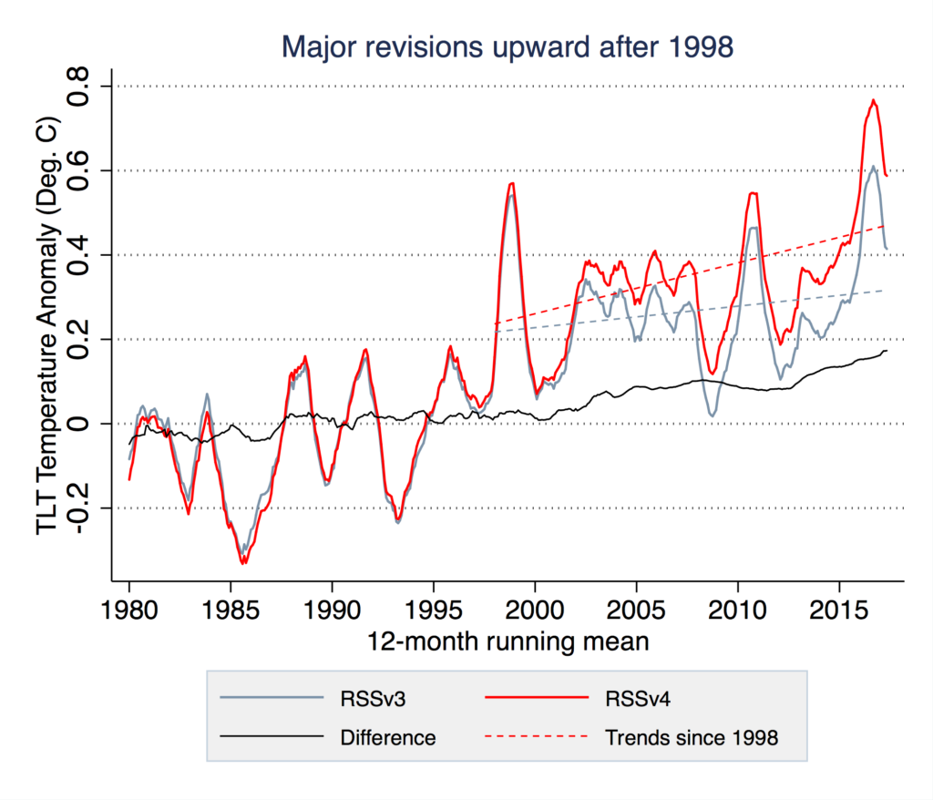
Denne grafen og myen har sitt opphav i en grov kalibreringsfeil med RSS-dataene.

RSS-dataene

Alle andre målesett og stasjoner viste oppvarming, men for fornektere ble RSS-dataene nå som en "hellig ku" de kunne tilbe. Og det gjorde de virkelig. Ut av alle temperaturdatasettene - land, sjø, værballonger og to fra satellitter (UAH og RSS) - var det faktisk bare ett datasett som hadde vist uventet langsom oppvarming de siste årene, RSS-dataene. Det er ingen overraskelse at det nettopp var RSS-datasettet som fornektere viste til - til tross for at det var allment antatt at RSS-dataene ble analysert feil.  

I 2014 kom sannheten ut: kreasjonisten Roy Spencer's UAH-team hadde gjort en stor feil i kalibrering av dataene sine. I stedet for ubetydelig øvre atmosfæreoppvarming fant de at den øvre atmosfæren hadde hatt en oppvarming på +0,14 grader per tiår, en dobling av 1880-2014-hastigheten på 0,07 grader per tiår. Det andre store satellittdatasettet, RSS, fant også en kalibreringsfeil, noe som betyr at jordens oppvarming var 140% raskere siden 1998 enn tidligere konklusjoner. Samtidig var de grunnbaserte dataene fra NOAA, NASA, Hadley senter og BEST alle i samsvar med hverandre. Når dataene for 2014, 2015 og 2016 også er inkludert, viser grafen den vitenskapelige sannheten: modellene er veldig i tråd med det vi observerer. 


Satellittene må passere over samme sted på jorden på samme tid hver dag for å få et temperaturgjennomsnitt. I virkeligheten forskyves tiden satellitten bruker på sitt omløp ettersom dens bane sakte synker. For å kompensere for denne og andre omløpsmessige endringer, må en rekke justeringer påføres dataene.

Flere grupper av forskere begynte å se nærmere på denne unormaliteten. Med så mye annet bevismateriale som indikerer oppvarming, virket det usannsynlig at troposfæren ikke ville varme opp. Feil ble oppdaget i metodene som UAH-gruppen brukte for å justere dataene. 

Så istedenfor å si, gi offentligheten den beste vitenskapen, ser Spencer sin "jobb" som å overtale offentligheten til ikke å støtte tiltak for å redusere karbonforurensning. Så det er ingen overraskelse at Spencer valgte en slik misvisende overskrift, til tross for at hans eget diagram som  kjører 13-måneders gjennomsnitt klart viser at temperaturene stiger.


Alle temperaturdata viser den samme oppvarmingen: HER OPPDATERT 2018:


All temp data available, including the satellite data shows the same warming of 1.1 C (2.0 F) since about 1880.


Global oppvarming i riktig langsiktig sammenheng:


Kirsebærplukker vi ut akkurat årene etter El Ninö-året 1998 og 18 fremover ser vi at, joda, det ble ikke "varmere", MEN disse årene var likevel rekordvarme år i et historisk perspektiv. Den langsiktige trenden viser at temperaturen økte mye før, og spesielt etterpå.

HVA SIER FAKTASJEKKERNE?: 
Den respekterte Pulitzerpris-vinnende faktasjekkeren Politifact bekrefter de nye varmerekordene.
Også den solide faktasjekkeren FactCheck.Org debunker myten om at global oppvarming har stoppet opp.


Vår venn Potholer54 bruker faktasjekking og oppdatert vitenskap i denne brutale debunkingen. Nyt!


Bonus

How to FAKE a “Pause” in Global Warming

Climate deniers love to declare a “pause” in global warming. What they don’t seem to care for is finding out the truth about whether or not it’s real. When it becomes so obvious global warming hasn’t paused that claiming it’s still paused becomes untenable, they’ll declare that it did — for a while, at least — and that it has already begun another “pause” — with the same amount of real evidence as before. None, that is.

No problem! Just fake it. But how? All you fellas out there with deniers to impress, it’s easy to do, just follow these steps.


fredag 1. desember 2017

FAKE GRAPHS AND MEMES

FALSKE KURVER OG GRAFER 


Her er noen eksempler på hvordan tåkeleggerne forkludrer grafer:

Såkalte "klimaskeptikere" distribuerer et arsenal av villedende grafer, for å nedgradere den menneskelige innflytelsen på klimaet. Bildet nedenfor er spesielt utbredt. Den vises på mange "klimaskeptiske" nettsteder og oppdateres jevnlig. Folk som er vant til kildekritikk og kritisk tenking ser at disse grafene er fake. Men de blir likevel repostet om og om igjen på fornektersider. Her blir den debunket:

 
The weirdest millenniumMye forskningsinnsats de siste årene har gått med til å rekonstruere temperaturhistorien i det siste årtusen og utover. IPCC-rapporten (AR4) samler et dusin rekonstruksjoner for temperaturen på den nordlige halvkule. (Manglende data tillater ikke robuste rekonstruksjoner for den sørlige halvkule.) Uten unntak viser rekonstruksjonene at nordlige halvkule temperaturer nå er høyere enn noen gang i løpet av de siste 1000 årene (figur 1), som bekrefter og styrker konklusjonene i den forrige IPCC-rapporten fra 2001.


Fig. 1: Figure 6.10 (panel b) from the paleoclimate chapter of the current IPCC report.


"Klimaskeptikere" liker ikke dette og fortsetter å komme opp med sine egne temperaturhistorier. En av de rareste som har sirkulert i årevis stammer fra den tyske læreren E.G. Beck. Denne kurven viser en middelalder varmeperiode som er varmere enn dagens klima med mer enn 1 ºC (se figur 2). Så hvordan fikk Beck denne kurven?


Fig. 2, modified from E.G. Beck (we added the green parts).

Hans kurve er falsk på flere måter. Den er opprinnelig hentet fra den første IPCC-rapporten fra 1990 (fig.3 under) som kun var en shematic, et diagram, et estimat basert på ETT (1) sted i sentral England som og stopper i 1950, lenge før de siste 30 års dramatiske temperaturøkning, og følgelig har INGEN VERDENS TING MED GLOBAL OPPVARMING Å GJØRE.

Fig. 3. The past millennium as shown in the first IPCC report of 1990, before quantitative large-scale reconstructions were available. This curve was based on Lamb’s estimated climate history for central England.


På den tiden var det ennå ingen store temperaturkonstruksjoner tilgjengelig. For å gi en indikasjon på tidligere klimaendringer, viste rapporten H.H Lambs Sentral-England estimat. (Dessverre ble dette ikke oppgitt i rapporten - en overseelse som viser at IPCC-revisjonshandlinger i de tidlige dager ikke var det de er nå.

Men Beck stoppet ikke ved å bare bruke denne utdaterte kurven, han endret den som fremhevet i grønt i figur 2. Først la han til en feil temperaturskala - midtlinjen i den gamle IPCC-rapporten representerer 1 ºC, slik at Becks krav på 5 ºC overdriver tidligere temperaturvariasjoner med mer enn en faktor på tre. For det andre går den opprinnelige kurven bare opp til 1970-tallet. Siden da har de nordlige halvkule temperaturene økt med omtrent 0,6 ºC og i Midt-England enda mer - så uansett hva du tar denne kurven for, hvis den fortsatte frem til vår tid, ville den nåværende temperaturen ligge over middelaldernivået, som i de riktige rekonstruksjonene tilgjengelig i dag. Da dette ville ødelegge budskapet hans, brukte Beck en annen forfalskning : han utvidet kurven flatt frem til år 2000, og fikk dermed dekket over den kraftige observerte oppvarmingen vi har sett siden 1970-tallet. Med dette trikset ser kurven ut som om det var varmere i middelalderen enn nå.

Sceptical Science tar opp tråden " The original global temperature schematic which appeared in the IPCC First Assessment Report and seemed to show the Medieval Warm Period (MWP) hotter than Present was based on the central England temperature record, and ended in the 1950s. It was only a schematic, and based on one isolated geographic location. Subsequent IPCC reports showed actual hemispheric temperature reconstructions. They did not "disappear" the MWP, they simply presented the best available data.
Jones et al. (2009) explore the origins of this figure.  They note that the figure caption specifically stated that it was a schematic diagram, and not an actual temperature reconstruction
"as far as palaeoclimatologists were concerned the diagram was nothing more than how it was originally described in the caption: a schematic."
Jones et al. trace the schematic diagram back to a series used by H.H. Lamb, representative of central England, last published by Lamb (1982).  However, Lamb is plotting 50-year averages here, and the final data point appears to be 1950.  Jones et al. superimpose IPCC FAR Figure 7.1c (black) with Lamb's central England temperature (red) and added the Central England Temperature data up to 2007 (blue):


Også her kan en lese om hvor dette diagrammet har sitt opphav. Og klimafornekter-tåkeleggerne må jo ha dette inn med teskje: 
Diagrammet viser altså IKKE at det var varmere i verden under den såkalte "Medieval Warm period. (Det er varmere på kloden i dag.) Når IPPC senere kom med grafer om den globale oppvarmingen de siste 1000 år og den berømte Hockeykølla, da har de altså IKKE visket ut MWP, de har bare, endelig, tatt i bruk globale data (fra den nordlige halvkule), IKKE de regionale dataene i England fra dette nå utdaterte og misbrukte diagrammet. Derfor ser grafen slik ut i steden:


Se potholer54 sin fine oppklaring i denne videoen, sånn ca mellom det 9ende og det 14ende minutt:


Her ser vi hvordan bloggen WATTS UP WITH THAT fremdeles bruker denne latterlige grafen for å "motbevise" den berømte hockeykølla til Michael Mann og for å "poengtere" at IPPC motsier seg selv. Så patetiske og løgnaktige er altså de "profesjonelle" klimatåkeleggerne. De vet at det er løgn, men de produserer likevel disse bloggpostene for å "tilfredstille" sine "sheeples" -de som  har behov for å få sine følelser "bekreftet" og fordi disse skal spre løgnene videre i sosiale medier.


Denne bibelske tullegrafen, som ser ut som den er tegnet av et barn, er laget av kreasjonisten Cliff Harris. Den prøver å vise at lokale varmeperioder i fortiden har noe med dagens globale oppvarming å gjøre. Men denne grafen, er ikke global. Den har ikke engang en Y-akse. Gjesp. Og når denne kreasjonisten Cliff Harris ikke lager latterlige kurver som går sin runddans i klimafornekternes ekkokammere, hva gjør han da mon tro? Kan det være at han skriver artikler om chemtrails? Nei og nei hvor overraskende; konspira, kreasjonisme og klimafornekting på en og samme gang. Det er bare konspirablogger som natural news osv som bruker denne nå.


 Også denne grafen resirkuleres mye i fornekterland:


When climate deniers are desperate because the measurements don’t fit their claims, some of them take the final straw: they try to deny and discredit the data.

Fig. 1 Revision history of two individual monthly values for January 1910 and January 2000 in the GISTEMP global temperature data from NASA (Source: WUWT )

If you look at the black arrows, do you have the impression that the 0.71 ° C temperature difference is mainly due to data adjustments? Because the arrow on the right is three times longer than that on the left? Far from it – can you spot the trick? In the vertical axis, 0.3 ° C is missing in the middle! The adjustment is actually only 0.26 °C. Even that is quite a lot of course – and that’s because it is an extreme example. The January 1910 shown is the month with the second largest downward correction, obviously cherry-picked from the 1,643 months of the data series.

In the annual mean values and particularly for the temperatures since the Second World War, the corrections are minimal, as the following graph shows:


Climate Science Denial Group GWPF Admits It Used False Temperature Graph:


This next graph is lifted from a study which is not supporting the deniers narrative. So what do you do? You alter it.

Look at this Grinsted et al 2009 graph when its shown in the conspiracy denier blog NoTrickZone:


The rapid rise in sea level we are seeing in our time is erased from the graph.Here is how the graph looks like in the Grinstead et al 2009 paper:


Here we see how deniers try to make it look like the Greenland ice is in recovery.

Here is a picture they like to recycle. And again, its not taken directly from the Denmark meterological web site, but from a denier blog with the usual childish hand written adjustments and arrows etc. The usual denier trick is to use a natural variation like a short growth period and make the conclusion the ice is in recovery. Here they shows a graph that isn't including calving. 

Your Greenland graph is not taken directly from the Denmark meterological web site, but from a denier blog with the usual childish hand written adjustments and arrows etc. The usual denier trick is to use a graph of seasonal variations and claim its about long term ice trends and make the conclusion the ice is in recovery. Seasonal variation graphs do not include calving.


Its easy to be confused by SMB and TMB (surface mass balance vs total mass balance). Every year Greenland gains ice (SMB) but then loses more mass during melt season through basal melt and calving. (Denier blogs will only tell you about SMB and claim Greenland is gaining ice).

But what does the bigger picture tell us? Whats the long term trend INCLUDING calving?

If we go to the Denmark met site again, we get the whole picture. Look at the words right above the picture. This is the sentence the article in the denier-blog ClimateDepot never mention.

"Satellite observations over the last decade show that the ice sheet is not in balance. The calving loss is greater than the gain from surface mass balance, and Greenland is losing mass at about 200 Gt/yr."


2020 Season Report: Polar Portal


For further information please contact climate scientist Peter L. Langen 
iskappe@dmi.dk.

If you contact the scientist listed on the web page, Peter L. Langen, he'll respond with something like this:

There is no evidence to be found in our work that the Greenland Ice Sheet is gaining ice at record rates. As we explain in the accompanying text, the ice sheet gains mass every year through snowfall (mainly during the period Sep-May) and loses mass through melt (mainly in Jun-Aug) and through ice berg calving (roughly all year). Our surface mass balance (SMB) curve shows the collective contributions from the two former, ie. snowfall accumulation and melting. At the end of the year, the cumulated surface contribution is usually a net positive number (as seen by the Aug 31 end of the dark grey curve). But when the negative contribution from ice berg calving is included, the total ice sheet mass balance may be negative. And it has been for a while, with a net loss averaging over 200 Gt per year for more than a decade (see the GRACE satellite derived total mass curve at the Polar Portal).

To write that “Greenland’s surface has gained more than half a trillion tons of snow and ice since September” as some sort of evidence of lack of global warming, is simply a misunderstanding of how things work: the ice sheet gains mass at the surface every year in the period Sep-May (because it is cold and snowy in Greenland that part of the year). This is also obvious from the dark grey mean curve and the light grey curves showing the interannual variability. This year’s curve is very near (and a tiny bit above) the mean curve and well within the band of interannual variability. So no records there.

But one record was set, as also described in our article on the Polar Portal: This year’s melt onset is the latest over the period of our calculations (since 1991). But as we also say in the article, this gives no statistical indication on whether it will be a big or small melt year in total. We will have to wait until the melt season is over to assess that.

About the sea ice extent curve (on which I am not an expert), which in the article you pointed to is said to track year 2006: when you go to the DMI-webpage from which the figure is taken, it says clearly that this version uses an old method of calculation and you should follow the link to a page with an improved methodology. On that page, this year seems to track years 2011 and 2012 quite closely. Either way, the real action is in the months Jul-Sep, so which year’s curve is tracked until now is less relevant than the weather we will see in the Arctic in that period.

Hope this is useful,

Peter

And just for the record. This is the state of the Greenland ice 


https://www.noaa.gov/media-release/unprecedented-arctic-warmth-in-2016-triggers-massive-decline-in-sea-ice-snow

Her er et annet eksempel på hvordan klimafornektere misbruker god vitenskap. Her får vi og konkrete eksempler på kirsebærplukking og hvordan grafer fikses på:

Recent attack on the so-called hockey stick graph is a compilation of 80 graphs from 2017 which consists of 76 graphs that describe local or regional situations, one graph that describes Northern Hemisphere situation, one graph that describes NH extratropics situation, and two graphs that describe global situation. As the hockey stick graph describes the situation in Northern Hemisphere, 80 graphs become 4 graphs, because local/regional graphs are meaningless in comparison to hemispheric/global situation.

Key words: Giant cherrypicks and manipulations and time frame problems:


Og bare på gøy, la oss sjekke ut en vilkårlig rapport. Jeg lander på grafen / rapporten som er lagt til grunn for Skandinavia. Vi har jo tidligere bevist, i DEL 1, at Skandinavia har blitt 1 - 1,5 grader varmere de siste 150 år, og særlig de siste 10-årene. Hvorfor er det ingen sammenheng mellom hva bloggposten prøver å bevise, hva rapportene de viser til prøver å bevise og hva denne grafen (bilde under) prøver å bevise?


Denne rapporten omhandler spesifikt regional avvik fra sommertemperaturer basert på data fra treringer. Den bekrefter den regionale varmeperioden i Skandinavia for 1000 år samt andre kulde og varmeperioder som er velkjent for klimavitenskapen". Videre, "The warmest 10- and 30-year periods were found in the 20th century. Faktisk bekreftes her de siste 10-årenes oppvarming. C-Scan indicates lower temperatures during the late MCA (ca. 1130–1210 CE) and higher temperatures during the LIA (1610–1850 CE) than G11." Nederst i rapporten står det jo og at den er innrapportert: "The new reconstruction, C-Scan, will be uploaded to NOAA and BALPAL, and all the data published in this study will be available for non-commercial scientific purposes." Med andre ord. Denne rapporten er altså allerede kjent for klimavitenskapen. Kanskje den allerede er tatt med i NASAs GISS data? Slike bloggposter sparker inn åpne dører. Det fremstilles som om disse rapportene, som kun omhandler regionale forhold, er nye og avslørende, men sannheten er at disse rapportene er innrapportert. De som er relevante for måling av global oppvarming er sannsynligvis allerede en del av dette datagrunnlaget.

Neste graf (under) er og populær i fornekterland. Dette fordi den ikke viser noen sammenheng mellom C02 nivåer og temperatur. Den viser og mye høyere C02 nivå i klodens fortid.

Miniatyrbilde 

Grafen blir så grundig debunked her at det nesten gjør vondt:

One of the most common fallacies in climate is the notion that, because the climate was hotter than now in the Eocene or Cretaceous or Devonian periods, we should have no concern for current global warming. Often this is combined with an implication that mainstream scientists are somehow unaware of these warmer periods (despite many of us having written multiple papers on previous warm climates). This is fallacious on multiple grounds, not least because everyone (including IPCC) has been discussing these periods for ages. Additionally, we know that sea levels during those peak warm periods were some 80 meters higher than today, and that impacts of the current global warming are going to be felt by societies and existing ecosystems that are adapted for Holocene climates – not climates 100 million years ago.

In making this point the most common graph that gets used is one originally put online by “Monte Hieb” on this website. Over the years, the graphic has changed slightly (versions courtesy of the wayback machine), but the essential points have remained the same. The ‘temperature’ record is a hand-drawn schematic derived from the work of Chris Scotese, and the CO2 graph is from a model that uses tectonic and chemical weathering histories to estimate CO2 levels (Berner 1994; Berner and Kothavala, 2001). In neither case is there an abundance of measured data.


Hva sier mannen bak C02 grafen, Robert A Berner, selv mon tro? La oss sjekke: Her er papiret det refereres til på grafen:
GEOCARB III: A REVISED MODEL OF ATMOSPHERIC CO2 OVER PHANEROZOIC TIME - ROBERT A. BERNER and ZAVARETH KOTHAVALA 2001

Berner skriver:
"Thus, exact values of CO2, as shown by the standard curve, should not be taken literally and are always susceptible to modification. Nevertheless, the overall trend remains. This means that over the long term there is indeed a correlation between CO2 and paleotemperature, as manifested by the atmospheric greenhouse effect"


Fornektere bruker altså denne grafen til å vise at C02 IKKE følger temperaturnivåer selv om mannen bak den sier at den gjør det!! Og det er er jo ikke rart en ikke finner sammenheng mellom C02 og paleotemperatur her når grafen viser kun temperaturen og C02 nivå. Men, det er andre faktorer som påvirker den globale temperaturen også. Legger vi på solens stråling/påvirkning ser vi at ting stemmer ganske godt. 

Og det er jo hinsides ironisk og komisk når amatørfornektere, som jo så ofte sier det er sola som styrer klimaet, IKKE inkluderer solen når de prøver å demonstrere at det ikke er sammenheng mellom CO2 og temperatur!

The assertion that only CO2 drives temperature it's as much a logical falacy as the sun being the only driver of temperature though science considers both. Its amusing that deniers, who say it's the sun which drives the climate, do not consider the sun when they try to demonstrate there is no correlation between CO2 and temperature. 

Tror fornekterne virkelig at forskerne ikke har kontroll på dette? Se graf her:


When CO2 levels were higher in the past, solar levels were also lower. The combined effect of sun and CO2 matches well with climate.

Richard Alley - 4.6 Billion Years of Earth’s Climate History: The Role of CO2:


Søstergrafen (under) viser heller ikke solens innvirkning.

Geologic Timescale

Virkninger av dagens globale oppvarming vil bli følt av samfunn og eksisterende økosystemer som er tilpasset for Holocene-klimaet i VÅR TID - IKKE klimaene og C02-nivåene som eksisterte for hundrevis av millioner år siden.


Flere studier om temaet:

Bathymetric and isotopic evidence for a short-lived Late Ordovician Glaciation in a Greenhouse Period

https://stephenschneider.stanford.edu/Publications/PDF_Papers/CrowleyBaum1995.pdf

A weathering hypothesis for glaciation at high atmospheric pCO2 during the Late Ordovician

Long-lived glaciation in the Late Ordovician? Isotopic and sequence-stratigraphic evidence from western Laurentia 


Denne neste grafen finner du på hundrevis av fornekter-blogger. 

Det ironiske her er at grafen faktisk viser global oppvarming, mens fornekterne tror den motbeviser global oppvarming. Kreasjonisten Roy Spencer pusher denne grafen skamløst. Her er sannheten om grafen.

"In fact out of all the temperature datasets — land, sea, weather balloons, and two from satellites (UAH and RSS) — only one dataset had shown unexpectedly slow warming in recent years, the RSS data. Unsurprisingly, that is the dataset deniers like Ted Cruz have glommed on to — despite the fact that it was widely believed the RSS data was being misanlayzed."

 
Several groups of scientists began looking closely at this discrepancy. With so many other pieces of evidence indicating warming, it seemed unlikely that the troposphere would not be warming. Errors were discovered in the methods the UAH group used to adjust the data. 

To understand what was wrongThe satellites must pass over the same spot on Earth at the same time each day to get a temperature average. In reality the time the satellite passes drifts slightly as the orbit slowly decays. To compensate for this and other orbital changes a series of adjustments must be applied to the data.

So rather than, say, providing the public the best science, Spencer sees his “job” as persuading the public not to support efforts to reduce carbon pollution. So it’s no surprise that Spencer chose such a misleading headline, despite the fact that his own chart’s running 13-month average clearly shows that temperatures are rising.

Denne studien oppklarer alt. Sensitivity of Satellite-Derived Tropospheric Temperature Trends to the Diurnal Cycle Adjustment
Press Release: 2016 Tropospheric Temperatures. A new press release from Dr. Carl Mears using the Temperature Total Troposphere (TTT) dataset shows that 2016 is the warmest year since the satellite record began in 1979.The previous record, set during the last major El Niño in 1998, was broken by 0.31 degrees Fahrenheit. 

Grafen viser helt klart oppvarming. Fornekterne har ennå ikke skjønt det. La oss se på grafen en gang til:


Nå, la oss se på noen flere av de håpløse grafene som klimafornektere har resirkulert i årevis, inkludert denne John Christys “berømte” løgnaktige graf:Rasmus Benestad, D.Phil. Seniorforsker ved Meteorologisk institutt og leder for Tekna Klima, oppklarer Bergsmarks følelser om grafen -og John Christys feiltolkninger her.


– Dette er figuren som viser klimaskeptikerens manglende fagforståelse


Graph shows a comparison between the average of an ensemble of 102 model calculations and observations (average of 3 satellite measurements and 4 balloon measurements).

They have clearly not understood that they compare different sizes, so that they can not dismiss model calculations based on such. (Dont expect to find 5 bananas if you add 3 apples with 2 plums.)

The model calculations shown by Christy and Bergsmark are derived from the Dutch data portal ClimateExplorer. However, model calculations of temperatures at different heights above the ground in this web portal can not be found, only the temperature near the ground.

The satellite measurements and balloons, on the other hand, represent the average temperature in a volume that stretches from the ground to a height of about 15 km.

In addition to various statistical sizes, Christy uses different physical measures in comparison when comparing temperatures at the surface with the temperature of 15 km of the atmosphere.

Increased greenhouse effect causes the lower part of the atmosphere (troposphere, which goes up to about 10km) to get warmer while the above layers of the stratosphere become colder. Does anyone see the problem with this comparison?

Not only that. The satellite measurements are also model calculations,. In fact, they base on similar models that show that CO2 provides global warming. Ironically, neither Spencer nor Christy have realized this fact.

In addition, the satellite curve is sewn together by different satellites with short lifespan, and the measurements from the different satellites are scattered. It is not so easy to put them together to a reliable temperature curve. They have been corrected several times.

In other words, the figure of Christy and Spencer reveals basic deficiencies in understanding both statistics and physics.

Her er en fin debunk av grafen:


This animation shows the flaws in a chart frequently presented by John Christy in the media and Congressional testimony. The chart has not been published in a peer-reviewed journal. The frame showing the fully annotated chart is available here.

The final frames of the animation compare modeled and observed changes in global surface temperature (Mann et al. 2015), sea level rise (IPCC AR5), Arctic sea ice (Stroeve et al. 2012), and ocean heat content (Cheng et al. 2015).
Climate scientists, using current science, are successful in predicting temperatures. 

RealClimate har en fersk og solid oppklaring av grafen her og her. 

Grafen dukker opp over alt i klimaløgnverden. Her ser vi f.eks Fred Goldberg bruke denne samme løgnaktige grafen i en YouTube-video:


https://blogger.googleusercontent.com/img/b/R29vZ2xl/AVvXsEgNQfFu3SAUGwB21S5gEE6NBirsJl0bTPfturJuYxX4Ptx9UN-S5dlf1w9lr6g9L8qO5j65B_i5LOBREy_UwgWMfsR5bsa_QMGkogLEdobM21y89-kYsZ3LsIXr63haLt3nq6nJ1HBMVVfB/s1600/SpencerDeception2.png

BONUS:

THE UPDATED CORRECT COMPARISONS:

Comparing CMIP5 & observations


Roy Spencer's latest deceit and deception.

___________________________________________________


Ingen bildebeskrivelse er tilgjengelig.

Reconstructed global temperature over the past 420,000 years based on the Vostok ice core from the Antarctica (Petit et al. 2001)." 


Now explain to me how global temperatures can be reconstructed from this paper?

_____________________________________________________________


The next graph is also a deniers favorite. Its a trick they use all the time; Take a local / regional graph and make it represent global temp records.


Dr. Bye, Prof. Humlum, and Dr. Stordahl (BHS) rely on the GISP2 database to draw their graph.
Unfortunately, GISP2 is concerned with local temperatures on Greenland which do not accurately represent the average global temperature – nor even the Northern Hemisphere. Drawing conclusions on the global climate based on GISP2 amounts to pretending that the whole world is affected by heavy rainfalls based on the precipitations in Bergen [a Norwegian city known for plentifull rainfall]. And worse:

The graph stops in 1855, long before the GW we have seen over the last 130 years.
the GISP2 “present” follows a common paleoclimate convention and is actually 1950. The first data point in the file is at 95 years BP. This would make 95 years BP 1855 — a full 155 years ago, long before any other global temperature record shows any modern warming.

In order to make absolutely sure of my dates, I emailed Richard Alley, and he confirmed that the GISP2 “present” is 1950, and that the most recent temperature in the GISP2 series is therefore 1855.

Confusing Greenland warming vs global warming

The man behind the graph, Dr. Richard Alley is debunking the deniers misrepresenting his work:

“no single temperature record from anywhere can prove or disprove global warming, because the temperature is a local record, and one site is not the whole world.”

Reality Check on Old Ice, Climate and CO2


Humlum innrømmer selv at denne grafen er bare tull:


https://www.skepticalscience.com/print.php?r=337

Grafen bruker altså temperatur-data fra toppen av Grønlands-isen. Data som er fra 1855!, (The reason is straightforward enough — it takes decades for snow to consolidate into ice.)  lenge før moderne global oppvarming begynte pga menneskers C02-utslipp, og som attpåtil kun gjenspeiler regional lufttemperatur og har ingen verdens ting med GLOBAL oppvarming å gjøre

Så sent som i desember 2016 var denne vitsen av en graf fremdeles en STOR sak på oljekrisa.no.

For ordens skyld:

What has happened to temperatures at the top of Greenland ice sheet since 1855? Jason Box is one of the most prominent scientists working on Greenland and he has a recent paper reconstructing Greenland temperatures for the period 1840-2007 (Box, Jason E., Lei Yang, David H. Bromwich, Le-Sheng Bai, 2009: Greenland Ice Sheet Surface Air Temperature Variability: 1840–2007. J. Climate, 22, 4029–4049. doi: 10.1175/2009JCLI2816.1). He was kind enough to supply me with a temperature reconstruction for the GRIP drilling site — 28 km from GISP2. This is what the annual average temperature record looks like (click for bigger version):


English version:

The graph ,and a few variations of it , is one of the most misrepresented graphs ever to be recycled by climate deniers.
Here is another version of it.
So whats wrong with it?
Nothing. But climate deniers are misrepresenting it.
For a start.
GISP2 is one (1) specific place on Greenland. It’s not global.
Unfortunately, GISP2 is concerned with local temperatures on Greenland which do not accurately represent the average global temperature – nor even the Northern Hemisphere. Drawing conclusions on the global climate based on GISP2 amounts to pretending that the whole world is affected by heavy rainfalls based on the precipitations in Bergen [a Norwegian city known for plentifull rainfall].
This is GISP2’s location on Greenland, hardly global ay?
Secondly.
The graph stops in 1855, long before the GW we have seen over the last 140 years. The GISP2 “present” follows a common paleoclimate convention and is actually 1950. The first data point in the file is at 95 years BP. This would make 95 years BP 1855 — a full 164 years ago, long before any other global temperature record shows any modern warming.
Lets bring in the man behind the graph, Dr Richard Alley:


The man behind the graph is debunking the deniers misrepresenting his work:
“no single temperature record from anywhere can prove or disprove global warming, because the temperature is a local record, and one site is not the whole world.”[…] An isotopic record from one site is not purely a temperature record at that site, so care is required to interpret the signal and not the noise. An extensive scientific literature exists on this topic, and I believe we are pretty good in the community at properly qualifying our statements to accord with the underlying scientific literature; the blogospheric misuses of the GISP2 isotopic data that I have seen are not doing so, and are making errors of interpretation as a result.
What has happened to temperatures at the top of Greenland ice sheet since 1855?
Jason Box is one of the most prominent scientists working on Greenland and he has a recent paper reconstructing Greenland temperatures for the period 1840-2007 (Box, Jason E., Lei Yang, David H. Bromwich, Le-Sheng Bai, 2009: Greenland Ice Sheet Surface Air Temperature Variability: 1840–2007. J. Climate, 22, 4029–4049. doi: 10.1175/2009JCLI2816.1). He was kind enough to supply with a temperature reconstruction for the GRIP drilling site — 28 km from GISP2. This is what the annual average temperature record looks like:

Fjellstad Olsen's answer to What are the causes of climate change?

____________________

Og bare for å gjøre et lite eksperiment. Du husker hva som var den mest sjuke, mest konspira, uvitenskapelige bloggen på internet? OK, NaturalNews, la oss sjekke der.....du mener ikke i ramme alvor at grafen finnes der.....? Sammen med den kreasjonistgrafen vi lo av nettopp?

 
Nevnte jeg at grafen også er å finne i den Exxon-sponsede klimaløgn-bloggen til Anthony Watts? La oss oppsummere;

Oljekrisa.no, NaturalNews, Heartlands Don Easterbrook og WUWT (mer om dem i Del 3) bruker altså nøyaktig den samme løgnaktige propagandaen. Også den australske "bestillingsverk for oljeindustrien-bloggeren" JoNova bruker denne latterlige grafen. Og dette hinsides latterlige "bevismaterialet" skal liksom "trumfe" over 100 år med klimavitenskap og tonnevis med beviser og observasjoner?

The idiot "GW have stopped in 1998 graph debunked:


Researchers from Remote Sensing Systems (RSS), based in California, have released a substantially revised version of their lower tropospheric temperature record.

After correcting for problems caused by the decaying orbit of satellites, as well as other factors, they have produced a new record showing 36% faster warming since 1979 and nearly 140% faster (i.e. 2.4 times larger) warming since 1998. This is in comparison to the previous version 3 of the lower tropospheric temperature (TLT) data published in 2009.


Here we see how deniers make their fake graphs:


If we were climate deniers, how could we graph some temperature data that would “hide the incline”? Let’s start by graphing data, not for the whole world, but for a very small piece of it. After all, the variability of temperature in small regions is greater than the variability of global temperature so this will increase the amount of fluctuation and make the trend far less obvious — even if it’s still there.
So let’s pick a record that is well-known and highly reputable: CET, the central England temperature record. It even covers a longer time span than the global estimates! Here’s yearly average temperature (not temperature anomaly) from the CET record:
See how they turn this:


into this:


Another example:

Suppose I wanted to convince people that temperature in the USA wasn’t going up, it was going down. What would I show? Let’s try yearly average temperature in the conterminous U.S., also known as the “lower 48 states” (I’ll just call it “USA”):


The "how to take NOAAs 1.02 c warming per century" number down to a more climate denier "friendly" 0.69 c per century number.

If you go to NOAAs Global Temperature Anomalies - Graphing Tool
on their home page


and plot global LAND temperatures, all months, from 1880, you get this:


a 1.02 c per century number which is 100% in tune with all the other temperature data.

But deniers include the oceans to get the number down to 0.67 c per century.

Then it looks like this:


The next is also much recycled in denial-land:


Det neste bildet er selvforklarende. I klimafornekterland er dette bevis for at NOAA "planter" falske data. Men hva er det som egentlig skjer?

NOAA er på sine nettsider helt åpne om at kartene av typen til venstre er regnet ut med statistiske metoder og interpolering mellom datapunkter: 

NOAA are 100% open about the fact that some temperature data are calculated using statistical methods and interpolation between data points. This is normal. Everyone who knows just a little bit about this topic, KNOWS this.

Deniers are kicking in open doors because;

Everything is available on their web pages and in the peer reviewed literature.

And there is conciliense and convergence science at work here. NOAAs data is confirmed by oceans data and satellite data which also shows the same warming trend.INCLUDING the UAH satellite data from Roy Spencer and John Christy which deniers always have referred to as "the most reliable" data.


Land surface temperatures are available from the Global Historical Climate Network-Monthly (GHCN-M). Sea surface temperatures are determined using the extended reconstructed sea surface temperature (ERSST) analysis. ERSST uses the most recently available International Comprehensive Ocean-Atmosphere Data Set (ICOADS) and statistical methods that allow stable reconstruction using sparse data. The monthly analysis begins January 1854, but due to very sparse data, no global averages are computed before 1880. With more observations after 1880, the signal is stronger and more consistent over time.

How is the average global temperature anomaly time-series calculated?

The global time series is produced from the Smith and Reynolds blended land and ocean data set (Smith et al., 2008).

https://journals.ametsoc.org/doi/10.1175/2007JCLI2100.1

This data set consists of monthly average temperature anomalies on a 5° x 5° grid across land and ocean surfaces. These grid boxes are then averaged to provide an average global temperature anomaly. An area-weighted scheme is used to reflect the reality that the boxes are smaller near the poles and larger near the equator. Global-average anomalies are calculated on a monthly and annual time scale. Average temperature anomalies are also available for land and ocean surfaces separately, and the Northern and Southern Hemispheres separately. The global and hemispheric anomalies are provided with respect to the period 1901-2000, the 20th century average.

Why do some of the products use different reference periods?

The national maps show temperature anomalies relative to the 1981–2010 base period. This period is used in order to comply with a recommended World Meteorological Organization (WMO) Policy, which suggests using the latest decade for the 30-year average. For the global-scale averages (global land and ocean, land-only, ocean-only, and hemispheric time series), the reference period is adjusted to the 20th Century average for conceptual simplicity (the period is more familiar to more people, and establishes a longer-term average). The adjustment does not change the shape of the time series or affect the trends within it.

Her er en annen oppklaring:

The most obvious difference is that as the name implies, the ERSST includes data from over the oceans. These data are gathered by buoys, ships, and satellites. A not so obvious difference is that NOAA's merged land–ocean surface temperature analysis incorporates GHCN-M land-based stations that are not used in the GHCN-M land-only map. The locations and ages of the 7280 Global Historical Climatology Network (GHCN) stations are depicted below. Note that the vast majority of the stations in Africa are less than twenty years old.

The land-only analysis uses GHCN-M stations only. It does not use satellite data. Because of this it excludes stations that don't have a solid history of measurements from 1981. This would include the GHCN-M station at the Kigali International Airport in Rwanda, whose data coverage over the last 40+ years is only 48%. The GHCN-M-based land-only map only uses about 2600 of the 7280 GHCN-M stations.

The NOAA Merged Land Ocean Global Surface Temperature Analysis uses satellite data as a sanity check. This enables it to use most of the ~4700 GHCN-M stations excluded from the land-only map.


BONUS - US data:


"Temperature measurements made with different instruments and methods over time must necessarily be adjusted to ensure high-quality records of temperature that reliably represent changes. The adjustments needed for land stations in the United States often increase the apparent long-term warming, but overall, adjustments actually reduce the global warming trend."

The data are made available on their website as the original data, the quality controlled and the homogenised versions on a station-by-station basis. The methods by which they undertake the analysis are fully documented in several papers in the peer-reviewed literature available from their website
The code they use to determine the adjustments is made available without restriction via their website.
_________________________________________________________________________

Denne er hentet fra kommentarfelt-"krigen", der en amatørfornekter prøver å vise til at det er en nedgang i skogbranner, mens C02 nivået øker, noe som da tilsynelatende motbeviser AGW

This is taken from the facebook - "war", where an amateur denier tries to show that there is a decline in forest fires while the C02 level is increasing, which apparently disproves AGW.


Studien dette er hentet fra er / Here is the study graph is taken from:

Spatial and temporal patterns of global burned areain response to anthropogenic and environmentalfactors: Reconstructing global fire historyfor the 20th and early 21st centuries

Yang, J., H. Tian, B. Tao, W. Ren, J. Kush, Y. Liu, and Y. Wang (2014), Spatial and temporal patterns of global burned area in response to anthropogenic and environmental factors: Reconstructing global fire history for the 20th and early 21st centuries, J. Geophys. Res. Biogeosci., 119, 249–263, doi:10.1002/2013JG002532.

But what are the conclusions from the study? Are they the same as the claim, "seems like an inverse relationship to me"? Notice the C02 line added to the graph, which misrepresent what the study set out to do. And no, the study does not support the claim.

Global burned area going down is primarily because of human activities, which the study clearly tells; Its about deforestation, increased crop lands and population increase.


"In our study, human impact was identified as the primary factor accounting for the declining trend in global fire activity, which reduced global burned area"

In the tropics, cropland area increased by 76.6%, and population increased by 310% from the 1900s to 2000s

Thus the graph is not proof against AGW. The study actually concludes with the opposite:

"The impact of climate change in extratropics is becoming increasingly important and may induce more fires in the context of global warming".


Those sceptical about the role of climate change in the recent increase in fires have pointed to the full dataset, trying to argue that the fire area has decreased by around 80% over the past century.

This is not an accurate comparison, according to Randy Eardley, a spokesman at the NIFC. As he tells Carbon Brief:
I wouldn’t put any stock in those numbers. To try and compare any of the more modern data to that earlier data is not accurate or appropriate, because we didn’t have a good way to measure [earlier data]. Back then we didn’t have a reliable reporting system; for all I know those came from a variety of different sources that often double-counted figures. When you look at some of those years that add up to 60 or 70 million acres burned a lot of those acres have to be double counted two or three times. We didn’t have a system to estimate area burned until 1960, but it was really refined in 1983.
https://ourworldindata.org/natural-disasters


Burning history - fiery furphies.

This post is about some exaggerated accounts that circulate about past forest fires. The exaggeration had been part of a normal human tendency - no-one cares very much whether accounts of events that caused suffering inthe past may be inflated, and so the more dramatic stories win out. But then maybe it does begin to matter.

The organisation currently responsible for presenting US fire history statistics is the National Interagency Fire Center. And their equivalent table lists data back to 1960, which pretty much agrees where it overlaps with the old census data to 1970. But they rather pointedly go back no further. And at the bottom of the table, they say (my bold):

"Prior to 1983, sources of these figures are not known, or cannot be confirmed, and were not derived from the current situation reporting process. As a result the figures above prior to 1983 shouldn't be compared to later data."

Again we see deniers misusing facts to suit their narrative.

Bildet kan inneholde: tekst som sier 'NATIONAL INTERAGENCY FIRE Total Wildland Fires and Acres (1926-2019) The National Interagency Coordination Center at NIFC compiles annual wildland fire statistics for federal and state agencies. This information IS provided through Situation Reports, which have been In use for several decades. Prior to 1983, sources of these figures are not known, or cannot be confirmed, and were not derived from the current situation reporting process. As a result the figures prior to 1983 should not be compared to later data. Year Source: National nteragency Coordination Center Fires Acres'

Bildet kan inneholde: tekst som sier '32 28 The frequency of extreme heat events is increasing. 24 20 16 of Number 2 8 4 l.amm 0 1910 1920 1930 1940 1950 1960 1970 1980 1990 2000 2010'


Bonus.

Even if the number were correct:

Also the US Forest Service are saying the opposite of what deniers claim:

Do you think the drop in burned forest areas in the US had anything to do with the US Forest Service was established in 1905?

With a more advanced fire fighting department?

With the Fire Management Today Forum created in 1936 to further inform the public on fire prevention matters?
Any drop was not related to GW not happening.

US Forest Service 

Here in our National Forests and Grasslands, these shifts include:
  • More frequent wildfires that burn larger areas
  • More severe problems with insects, pests, and diseases threatening trees and crops
  • Snowpack decline in mountainous regions due to decreased snowfall and shorter winters
  • Plant and animal ranges shifting northward to accommodate warmer temperatures
  • Threatened watersheds due to more frequent water shortages, increased pest and fire severity, and shifts in ecosystem health
http://wxshift.com/climate-change/climate-indicators/us-wildfires
https://waa.ai/alEc

"there is very well documented scientific evidence that climate change has been increasing the length of the fire season, the size of the area burned each year and the number of wildfires. These "ignition events" don't have a major effect on the scale of the fire, says Funk. But what does affect scale are prevailing climate conditions. And these have become warmer and drier - due to climate change.
Greenhouse gas emissions, via the greenhouse effect, are causing the global temperature to increase and the climate to change. This enhances the likelihood of wildfires.

Why?

Because warmer temperatures increase evaporation, which means the atmosphere draws more moisture from soils, making the land drier.

A warmer climate also leads to earlier snowmelt, which causes soils to be drier for longer. And dry soils become more susceptible to fire.

"The areas where wildfires are taking place are always areas that [have become] drier and hotter, and where spring has come earlier," said Funk.

Drier conditions and higher temperatures increase not only the likelihood of a wildfire to occur, but also the duration and the severity of the wildfire. Wildfires are typically either started accidentally by humans - such as a burning cigarette carelessly tossed out of a window - or by natural causes like lightning. 

What  the peer reviewed science say on forest burned areas:

"For all ecoregions combined, the number of large fires increased at a rate of seven fires per year, while total fire area increased at a rate of 355 km2 per year. Continuing changes in climate, invasive species, and consequences of past fire management, added to the impacts of larger, more frequent fires, will drive further disruptions to fire regimes of the western U.S. and other fire-prone regions of the world."

Large wildfire trends in the western United States, 1984–2011
GRL
DOI: 10.1002/2014GL059576

https://agupubs.onlinelibrary.wiley.com/doi/abs/10.1002/2014GL059576

And

"We show that fire weather seasons have lengthened across 29.6 million km2 (25.3%) of the Earth’s vegetated surface, resulting in an 18.7% increase in global mean fire weather season length. We also show a doubling (108.1% increase) of global burnable area affected by long fire weather seasons (>1.0 σ above the historical mean) and an increased global frequency of long fire weather seasons across 62.4 million km2 (53.4%) during the second half of the study period."

Climate-induced variations in global wildfire danger from 1979 to 2013
NATURE
doi:10.1038/ncomms8537

https://www.nature.com/articles/ncomms8537

"Anthropogenic increases in temperature and vapor pressure deficit significantly enhanced fuel aridity across western US forests over the past several decades and, during 2000–2015, contributed to 75% more forested area experiencing high (>1 σ) fire-season fuel aridity and an average of nine additional days per year of high fire potential.

Anthropogenic climate change accounted for ∼55% of observed increases in fuel aridity from 1979 to 2015 across western US forests, highlighting both anthropogenic climate change and natural climate variability as important contributors to increased wildfire potential in recent decades.

We estimate that human-caused climate change contributed to an additional 4.2 million ha of forest fire area during 1984–2015, nearly doubling the forest fire area expected in its absence.

Natural climate variability will continue to alternate between modulating and compounding anthropogenic increases in fuel aridity, but anthropogenic climate change has emerged as a driver of increased forest fire activity and should continue to do so while fuels are not limiting."

Abatzoglou and Williams 2016 - Impact of anthropogenic climate change on wildfire across western US forests
PNAS
doi: 10.1073/pnas.1607171113"

http://www.pnas.org/content/113/42/11770

______________________________________________

Extreme weather left its mark across the planet in 2016, the hottest year in recorded history. Record heat baked Asia and the Arctic. Droughts gripped Brazil and southern Africa. The Great Barrier Reef suffered its worst bleaching event in memory, killing large swaths of coral.

Now climate scientists are starting to tease out which of last year’s calamities can, and can’t, be linked to global warming.

https://www.nytimes.com/2017/12/14/climate/climate-extreme-weather-attribution.html?smid=fb-share

KLIMAENDRINGENE ØKER IKKE KOSTNADENE MED EKSTREMVÆR ?


Jo, det gjør de. Full debunk her.


____________________________________________


Climate-Change-Resized


Debunk:

https://skeptic78240.wordpress.com/2016/04/08/the-comical-conservative-6/?fbclid=IwAR1kN5n3ALxBtqa5vIkyy5HQ8TKEkXqQg1wusnxllc37iiq196Obsm4LKvQ

Dr David Viner at CRU, England, never said that "Snowfalls are now just a thing of the past.". That was the headline the newspaper choose for their article, making it more sensational but losing the plot.

Dr Viner was also quoted as saying: "We're really going to get caught out. Snow will probably cause chaos in 20 years time."

The headline in this case is not what the story itself said, as Dr Viner made clear. The story was about the frequency of snowfalls, and how "snow is starting to disappear from our lives", which it stated clearly.

So a headline saying that "snowfalls are now just a thing of the past" is not a scientific prediction or statement. It is a newspaper headline, and should be treated as an invitation to read the entire story, which in this case clearly pointed out that snowfalls are becoming less frequent in Britain.

https://www.independent.co.uk/news/science/steve-connor-dont-believe-the-hype-over-climate-headlines-2180195.html

https://tinyurl.com/yy4eglrz

Anyway. Climate science dont make predictions based on a newspaper interview with one (1) scientist. Its the combined knowledge from thousands of scientists world wide. Look for the predictions in the peer reviewed science and the peer reviewed reports.

Like this one out from the USA in the autumn of 2017 which was peer reviewed by the National Academy of Sciences, the worlds most respected scientific academy, founded by Abraham Lincoln and with 200 Nobel Prize winners as members.

https://science2017.globalchange.gov/

For regions that are less than 1000m above sea level and that currently experience winter temperatures just below freezing, he found that the chance of an extreme snowfall event will drop by an average of just 8%. But the total amount of snow that falls in these areas each winter may drop by as much as 65%, on average.
http://www.bbc.com/earth/story/20160127-will-snow-become-a-thing-of-the-past-as-the-climate-warms

DEBUNK 2:

'Snowfalls are now just a thing of the past'

In 2000, the UK’s Independent newspaper published an interview with scientist David Viner, who at the time was working at the Climatic Research Unit at the University of East Anglia.
Over the years, climate science “contrarians” have taken the article’s definitive headline, written by a sub-editor, as evidence that scientists' predictions on global warming are all wrong, and should be mocked.
Aside from stating the obvious (a headline is different than a newspaper story, which is also different than a scientific paper), some climate science deniers such as Breitbart’s James Delingpole have previously spread the myth that Viner actually uttered the words “snowfalls are now just a thing of the past” when he never actually said it.

Firstly, this is data from a single site (Vostok). Even though greenhouse gases may be well-mixed, the temperature is not. You need to be a little careful when using this single site to infer something about global temperatures, and the relationship between temperature changes and CO2/CH4 changes. Maybe more importantly, though, what the data indicates is not really all that surprising.

When the Earth comes out of an ice age, the warming is not initiated by CO2 but by changes in the Earth's orbit. The warming causes the oceans to release CO2. The CO2 amplifies the warming and mixes through the atmosphere, spreading warming throughout the planet. So CO2 causes warming AND rising temperature causes CO2 rise. Overall, about 90% of the global warming occurs after the CO2 increase.

The reason has to do with the fact that the warmings take about 5000 years to be complete. The lag is only 800 years. All that the lag shows is that CO2 did not cause the first 800 years of warming, out of the 5000 year trend. “The sequence of events during this Termination is fully consistent with CO2 participating in the latter 4200 years of the warm-”

What does the lag of CO2 behind temperature in ice cores tell us about global warming?

Roger Fjellstad Olsen's answer to What lags, C02 or temperature? Have you heard of the correct "It's both" alternative?

https://skepticalscience.com/col...

It confirms C02 as a driver for CC:
“Finally, CO2 and CH4 concentrations are strongly correlated with Antarctic temperatures; this is because, overall,our results support the idea that greenhouse gases have contributed significantly to the glacial –interglacial change. This correlation,together with the uniquely elevated concentrations of these gases today, is of relevance with respect to the continuing debate on the future of Earth’s climate.”

Try using a graph which includes modern warming.

Here we see the moment when natural climate change became AGW! The moment climate was forced out of its Natural Milankovitch cycle to head in the opposite direction:

Human caused climate changes is the abrupt u-turn in the OPPOSITE direction. If it was still a natural cycle, we should still be going slowly cooler down the “green” trendline towards the next ice age:
Roger Fjellstad Olsen's answer to What are the causes of climate change


Debunking the Caterpillar meme

  To sum up again, this time with the correct numbers: the ICE will still produce 160,000 * 150 = 24 tons of CO 2 the electric car will prod...